
Skånetrafiken / Power BI visual foundation
Establishing an accessible design system and reusable report template to support consistent data visualisation.
(All images in this project display fictitious data )
Client
Skånetrafiken / Team Analytics
What
A visual style guide for Power BI, focusing on accessibility, consistency and reusable design patterns for reporting.
Team
Collaborated with data visualisers, data engineers, product owner and brand manager.
My role
Responsible for defining the visual foundation for Power BI, including accessibility guidelines, colour system, typography, layout principles and reusable report patterns.
Tools used
Figma, PowerPoint
Duration/Year
Two months/ 2026
PURPOSE
As Skånetrafiken transitioned from Qlik to Power BI, there was a need for a shared visual foundation for future dashboards and reports.
Since Power BI was a new platform, there were no established guidelines for how reports should be structured, styled or communicate information.
The goal was to create a scalable foundation that balanced:
Accessibility
Brand consistency
Clear data communication
Reusable design patterns
Context and challenge
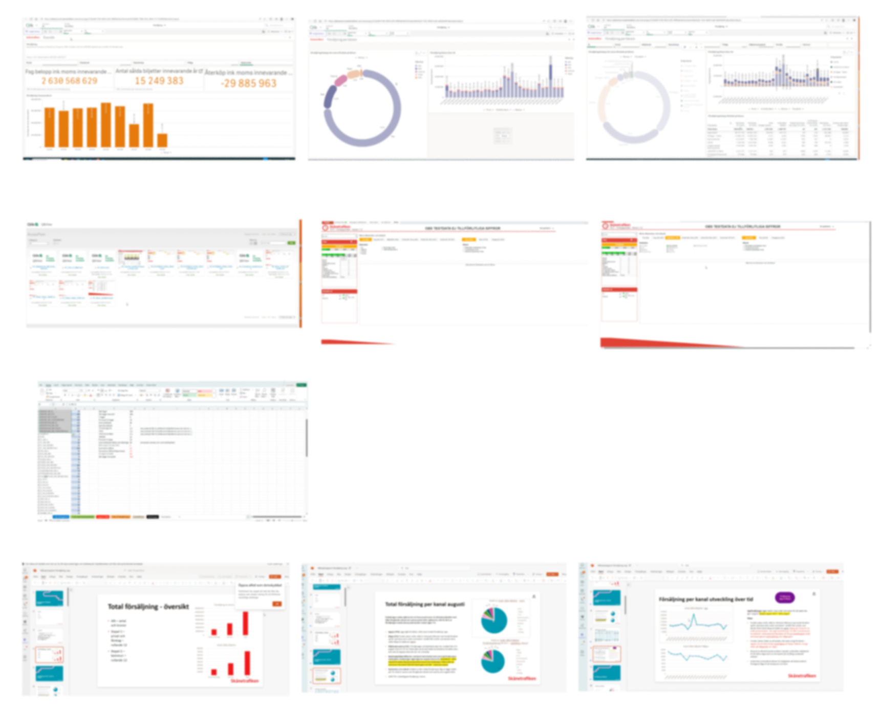
Examples of the current use of Qlik, Excel and other tools for data visualisaiton. A shared visual foundation was needed to create consistency across future reports.
PROCESS
I focused on creating a visual system and report template that could support different reporting needs across the organisation.
My approach
My work included
Developing an accessible colour system
Defining typography and layout principles
Creating reusable report structures
Establishing guidelines for data visualisation
Designing recurring elements such as header, footer and other widgets
Creating an accessible
colour system
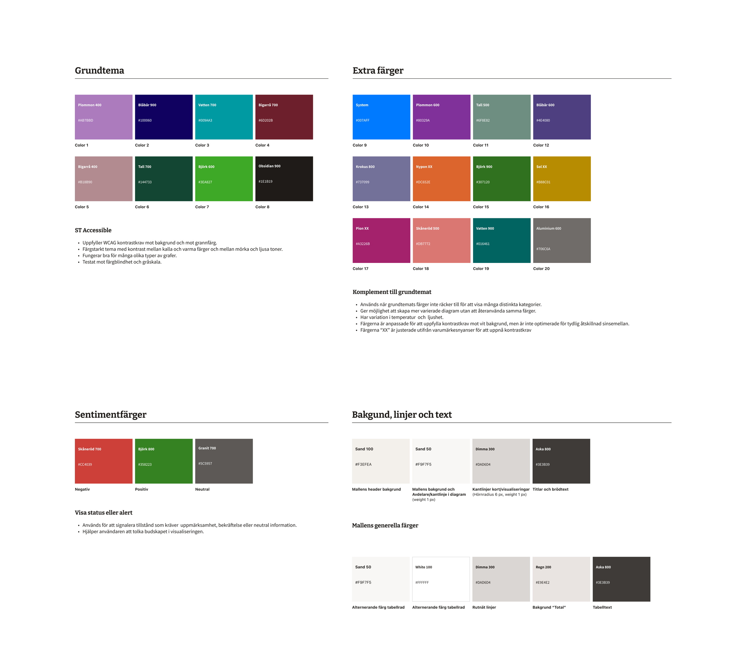
The colour framework was developed in collaboration with the brand manager and team, based on brand guidelines, WCAG requirements, colour blindness testing and data visualisation best practices.
The system included:
Theme colours
Supporting colours
Semantic colours for positive, negative and neutral states
Background and text colours
Design highlights
Accessibility-driven
Tested colour combinations using WCAG guidelines and colour blindness simulations.
Designed for meaning
Defined clear colour roles to support data interpretation.
Built for consistency
Created guidelines for using colours across different reports and visualisations.
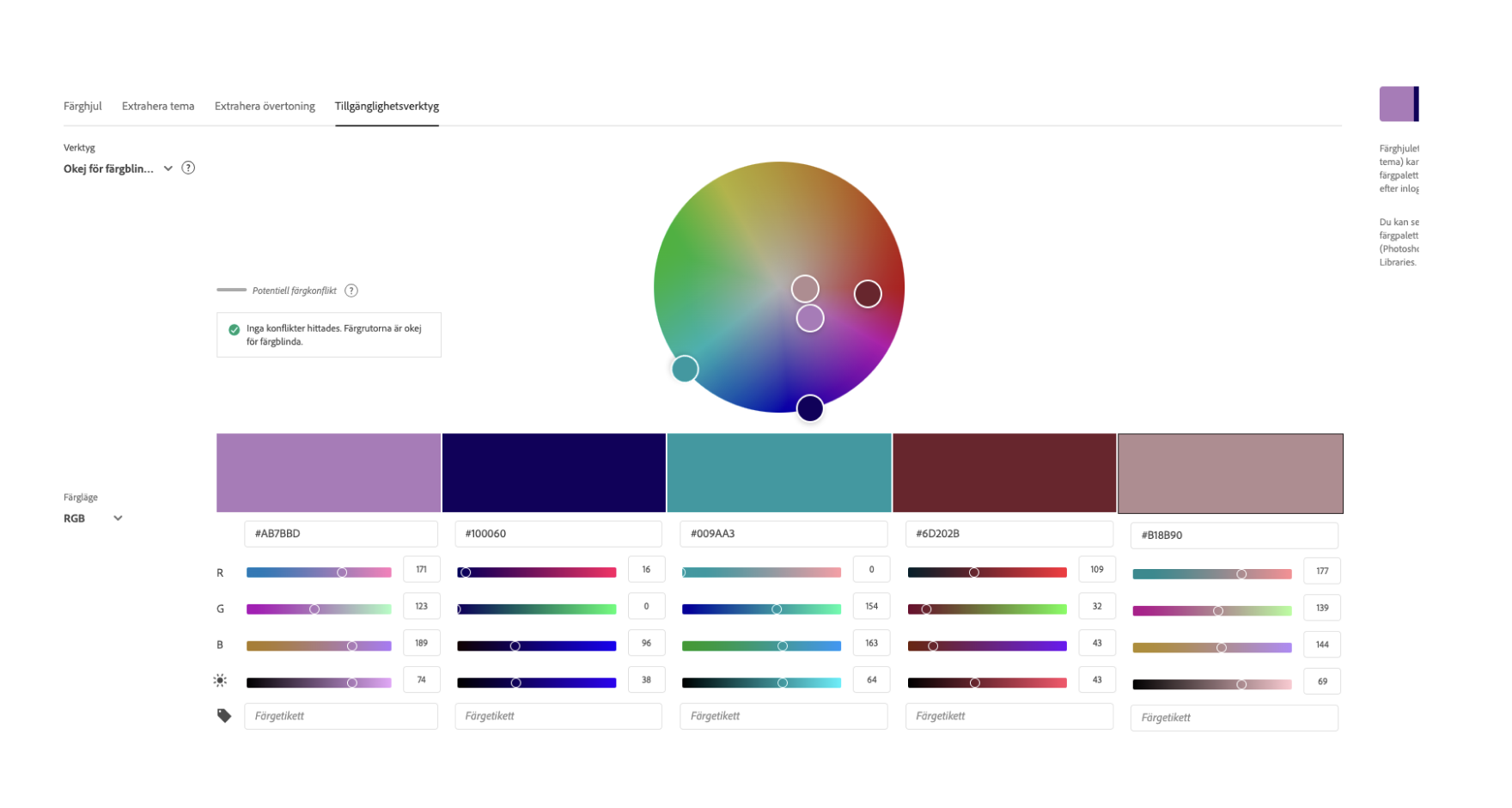
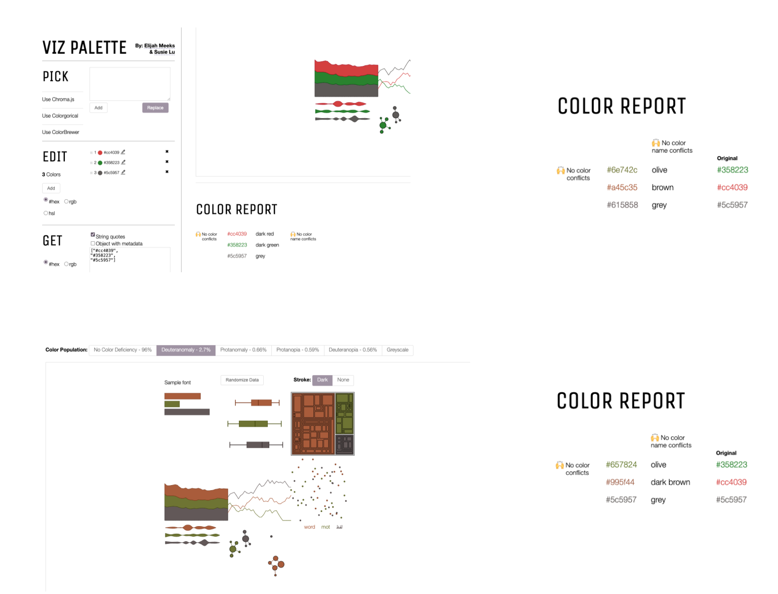
I evaluated colour combinations through WCAG contrast checks and colour blindness testing to improve readability.
Report template
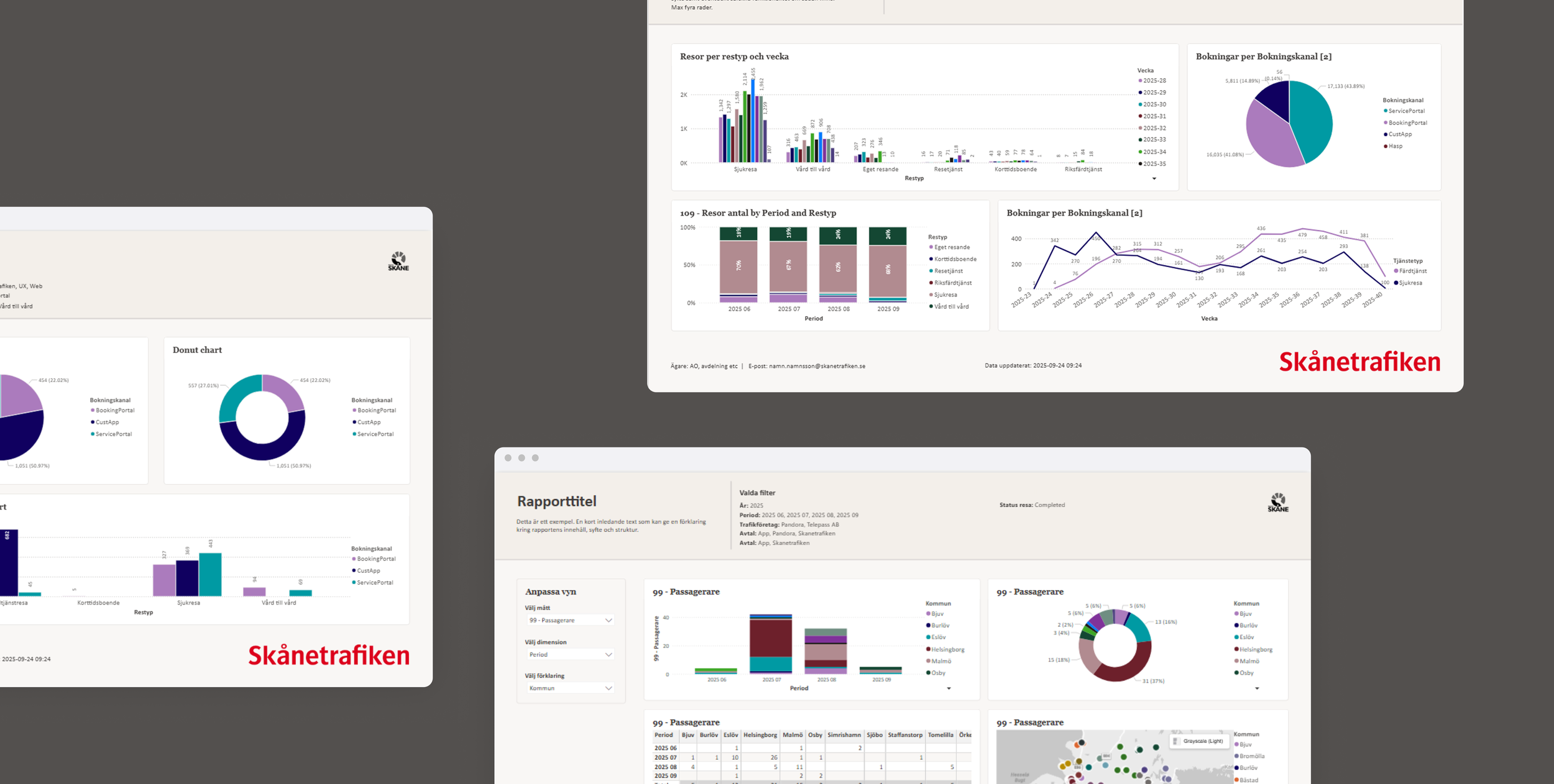
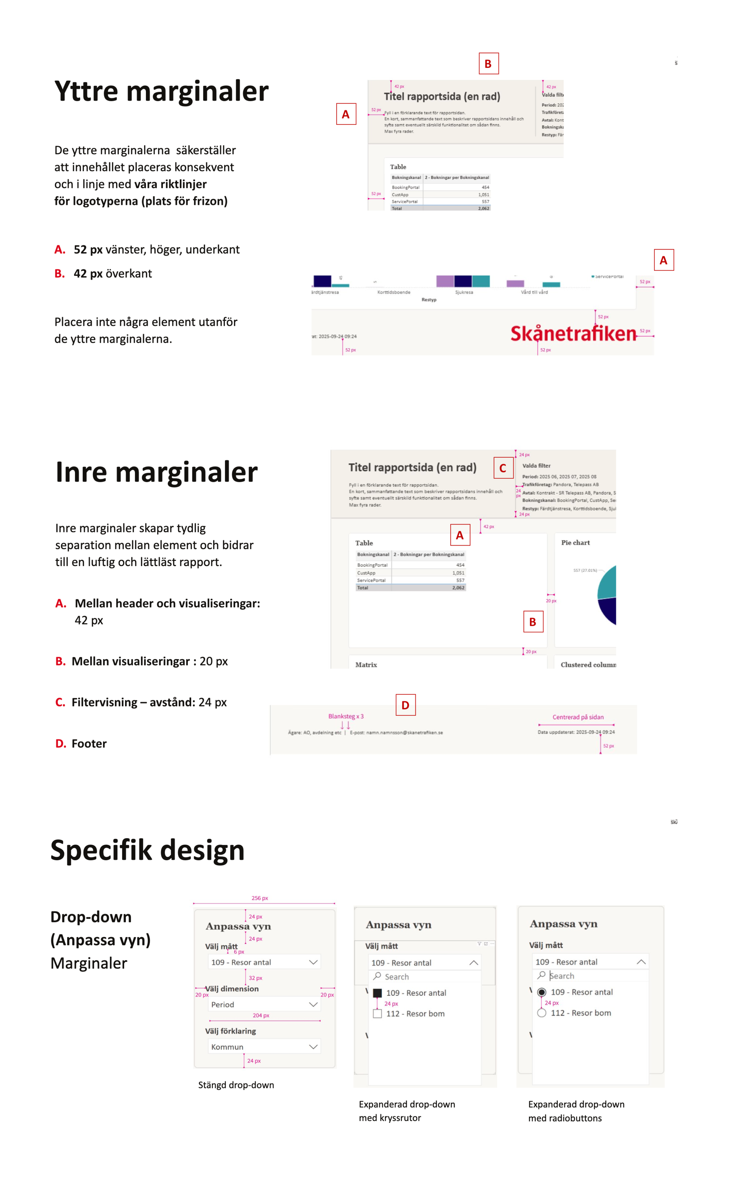
To support consistency across future Power BI reports, I created a reusable template with defined layout and structural patterns.
Design highlights
Structured header
Designed space for report title, description and filter handling to provide users with context and control.
Consistent footer
Included contact information, data refresh date and logo placement to improve transparency and consistency.
Layout principles
Defined margins, spacing and page structure to create a clear visual hierarchy.
Reusable components
Created patterns that could be adapted across different dashboards and reporting needs. ( Dropdowns and Measurement range input)
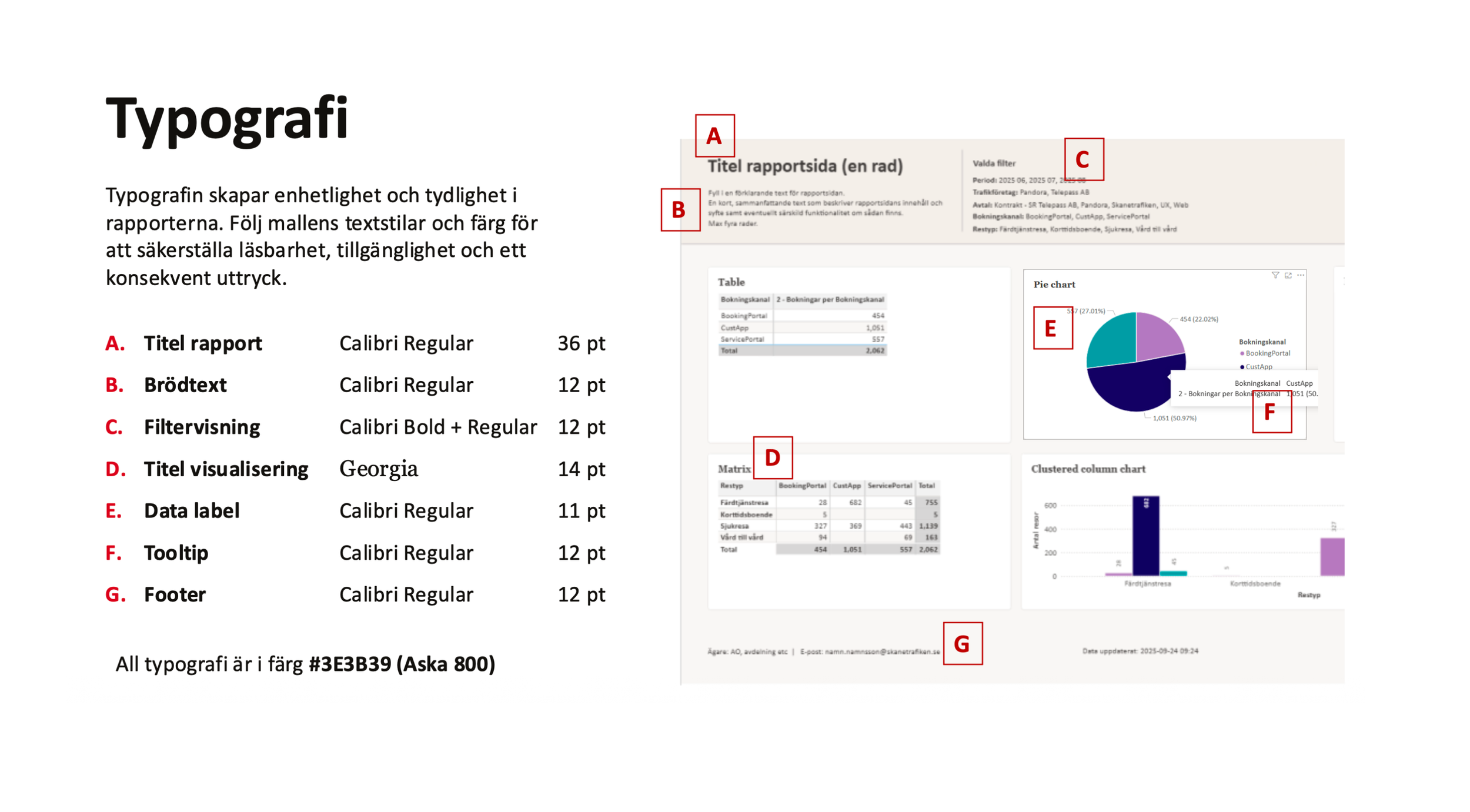
Typography was defined to align with the brand while working within Power BI's platform constraints.
Design highlights
Defined a clear text hierarchy for readability.
Standardised text styles for consistency across reports.
Selected typography that balanced brand identity and platform capabilities.
Typography
CONCLUSION
The outcome

The result
The project resulted in a shared visual foundation for Power BI reporting.
An accessible colour system
A reusable Power BI report template
Guidelines for typography and layout
The foundation was presented to stakeholders and prepared for use in future Power BI development.

My learnings
Data visualisation needs to balance visual design, accessibility and clarity.
Working with data, brand and technical teams was key, especially when working within Power BI's limitations.
Data visualisation requires a different UX mindset, with a focus on helping users understand and act on information.
Working on more UX-focused data visualization later gave me new insights and opportunities to improve the guidelines.

What would be the next step?
The guidelines will need to evolve as more Power BI reports are implemented and tested with users.
Early implementation has already highlighted areas to adjust, such as header and footer spacing and margins.