
Coride / Revitalizing the ride-sharing app
An app redesign and new business concepts
Client
Coride – A real life customer UX/UI project
Course in user centered design (EC education)
What
App redesign and new business concepts
Team
Group school project
My role
User research, workshop facilitator, UI, prototyping
(my focus was on the design of reward system), user testing
Tools used
Figma, user interviews, usability testing
Duration/Year
12 weeks / 2023
PURPOSE
We had in an earlier course concluded some issues with the ride-sharing app
The issues with Coride
Undefined target group
Very few users
Limited search function
Catch 22 situation – no trips registered means no users
We aimed to revitalize the app, through targeting students as a new user group. This was grounded in our hypothesis that students are be more willing to share a car, to save money.
The app and the low engagement
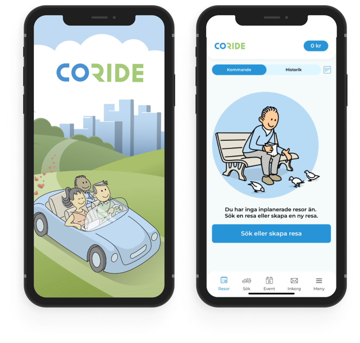
The current start page.
How can we make people start using the Coride app? The screens show the existing onboarding and search pages for Coride.
PROCESS
Research
A crucial part of the process was conducting a survey targeted at students.
Many students don’t want to carpool with strangers
96% of the students carpool or have carpooled at some point
46% of the students have access to a car
Research and ideation
“I don't travel with people I don't know who they are or know in any way. Then it becomes very limited.”
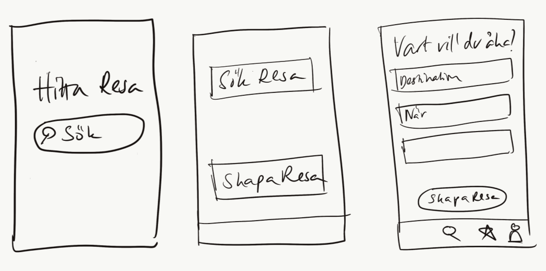
A more effective start page
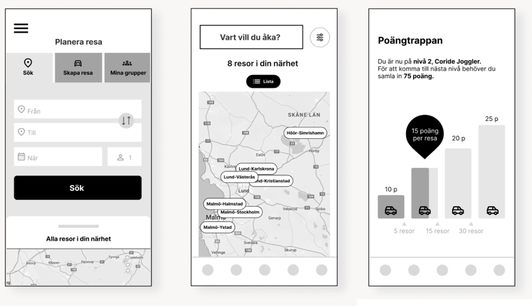
We drew inspiration from other travel apps to enhance the start page, prioritizing the display of essential functions.
Community and reward system
To raise user security, we introduced a community feature for group creation.
To encourage users to use this feature instead of organizing privately, we implemented a reward system.
My main focus was design of the reward system.
SOLUTION
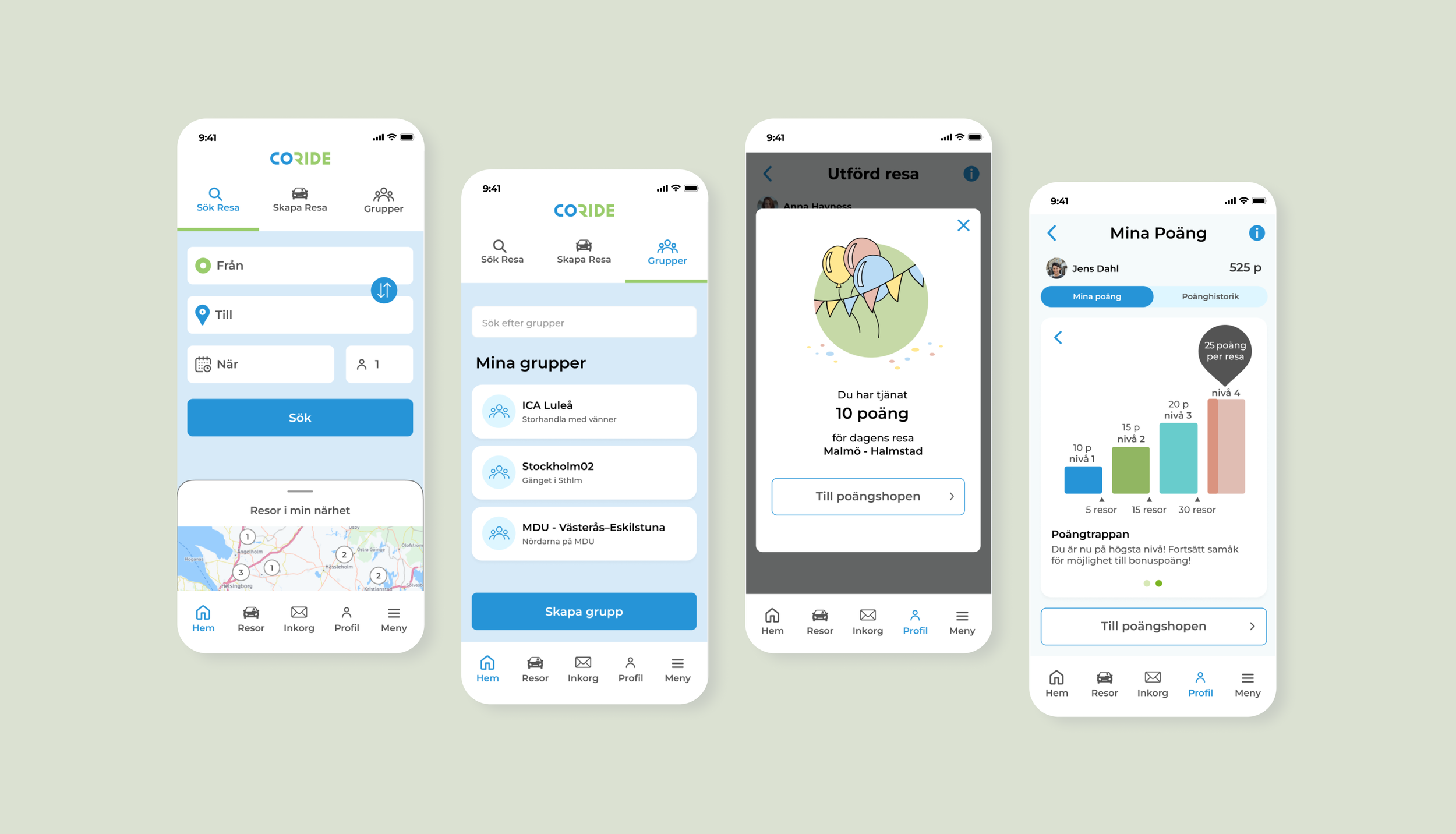
We ran a digital user test with a student who had replied on our survey. It went over all well – the design was seen as simple and clear. We used his feedback to improve our design.
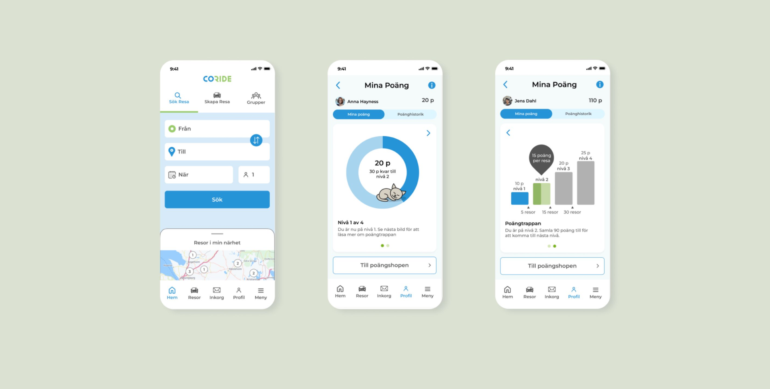
The High-fi design solution
“I actually think this is something I would use myself. Suppose this were to become reality, then I would probably start using this... This thing about supply and demand... if they match reasonably well, I think this would be magical.”
SOLUTION
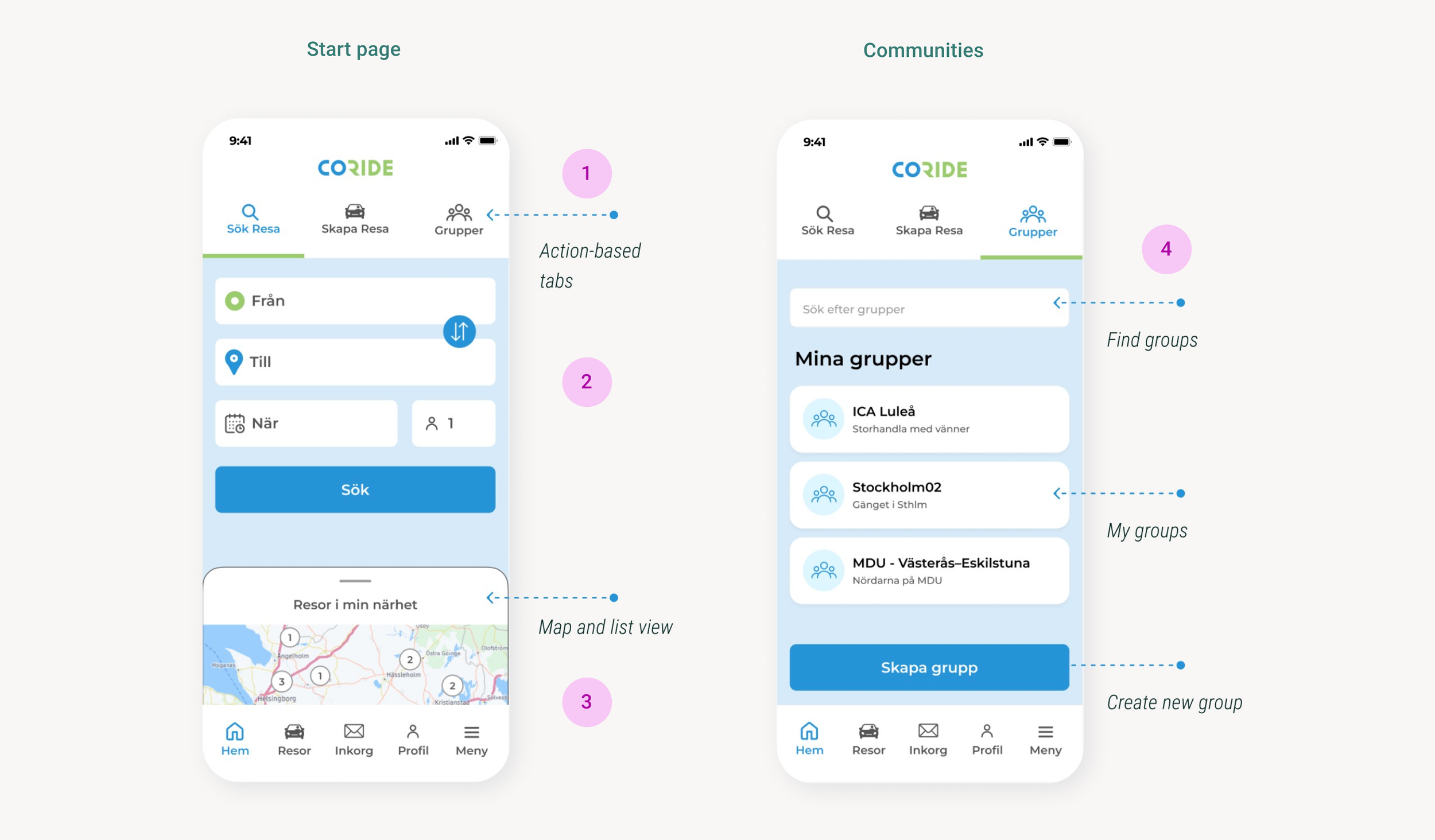
Clear action-based tabs for easy navigation (instead of role-based)
The start page shows the main functions, for a more intuitive user experience.
All available trips on a map / list show activity and trip options.
A group feature facilitating carpooling with acquaintances enhances user security.
The key features
“I recognize the map from other apps and feel safe with it.”
SOLUTION
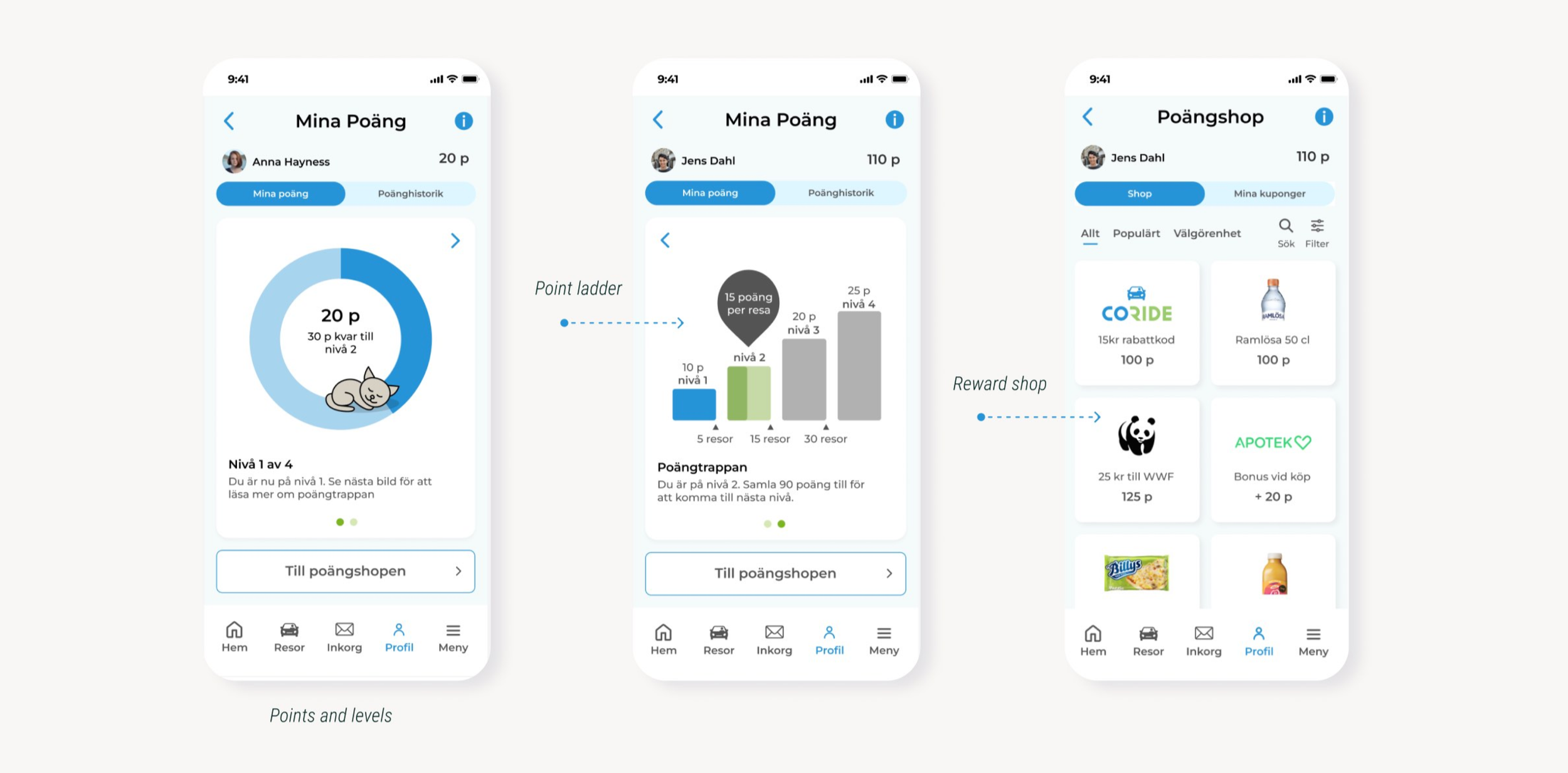
A rewards system encouraging users to coordinate
trips through the app by earning points in a point shop.
My focus was the design of the part “My Points”
(“Mina Poäng”)
The reward system
“…I think that it creates a very good incentive then, to use this points shop and to actually use this app frequently, instead of just once.
CONCLUSION
The outcome

The result
Although these concepts haven't been implemented, they offer innovative solutions to meet user preferences and needs, which could improve user retention.
Due to time constraints we couldn't involve users as much as we wanted..

My learnings
I got valuable insights in the crucial role of user involvement in improving functionality and usability
Prototyping showed how important it is for discussing and iterating together.
Great team work demonstrated how everyone's ideas contributed to the solutions.

What would be the next step?
Our main user centric tips to Coride in general
Conduct more research and user involvement
Accessibility-adapt the app to WCAG's AA level