
GoTo HUB / Visit Oslo
Design system and widgets to enhance sales
Client
GoTo HUB - Real life customer UI project (EC education)
What
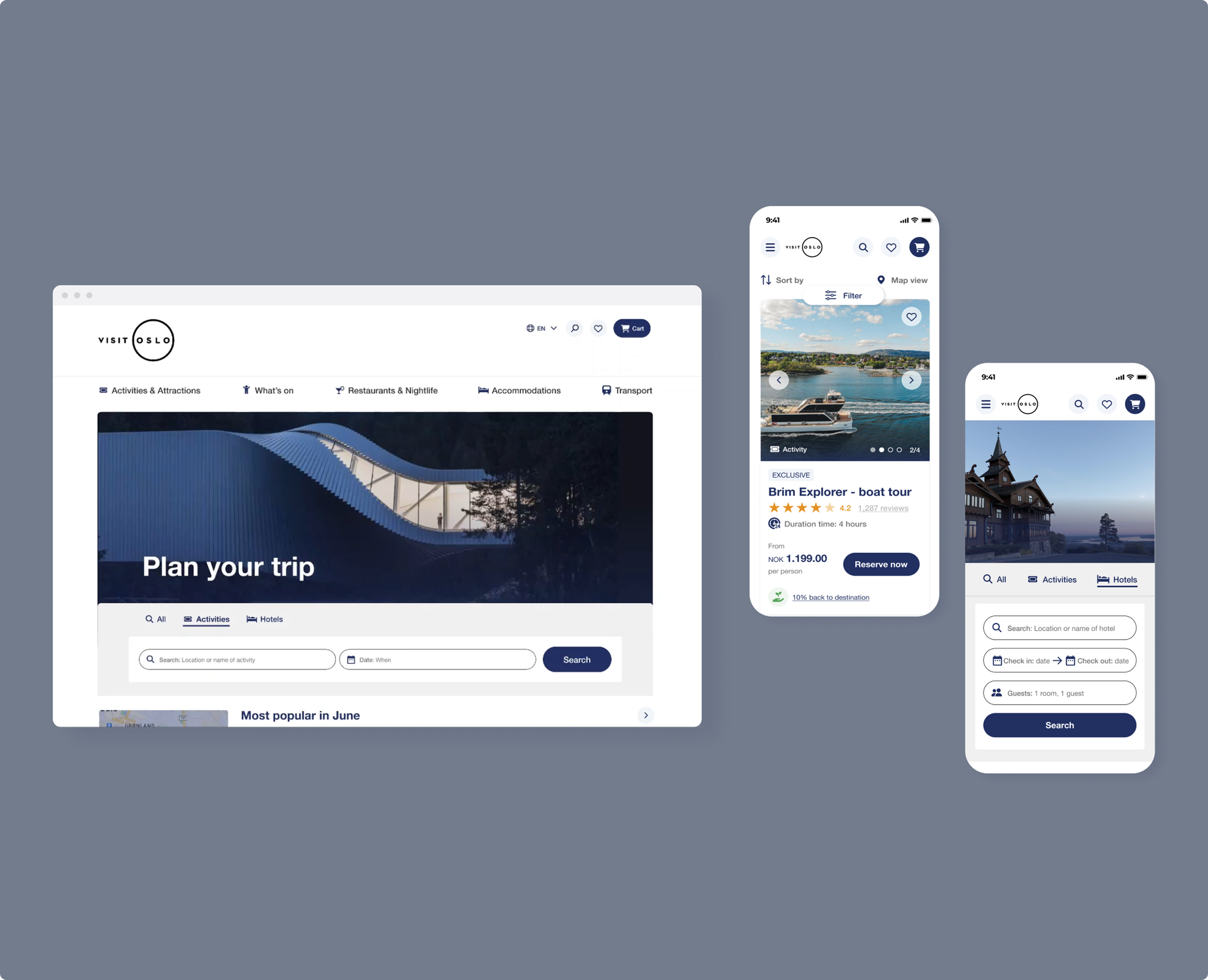
Redesign for desktop and app, with widgets like search bar, activity/hotel cards, product landing page, filter etc. Foundations of a design system.
Team
Individual project
My role
Best practice research, UI design, design system
(partly group project) prototyping
Tools used
Figma, Photoshop, Illustrator
Duration/Year
Six weeks / 2023
PURPOSE
GoTo Hub’s makes existing “Visit” organisations websites bookable, by adding widgets to them. To be able to convince Visit Oslo to use GoTo Hub as a booking solution, our task was to redesign the site to show how it could look if they embedded our booking widgets like a new search bar, filter and product listing page (amongst others).
The goal was to better showcase Visit Oslo and make them sell more services.
The product
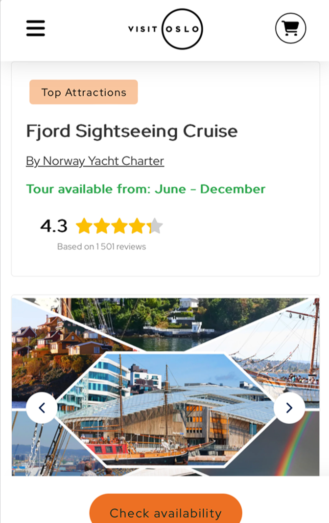
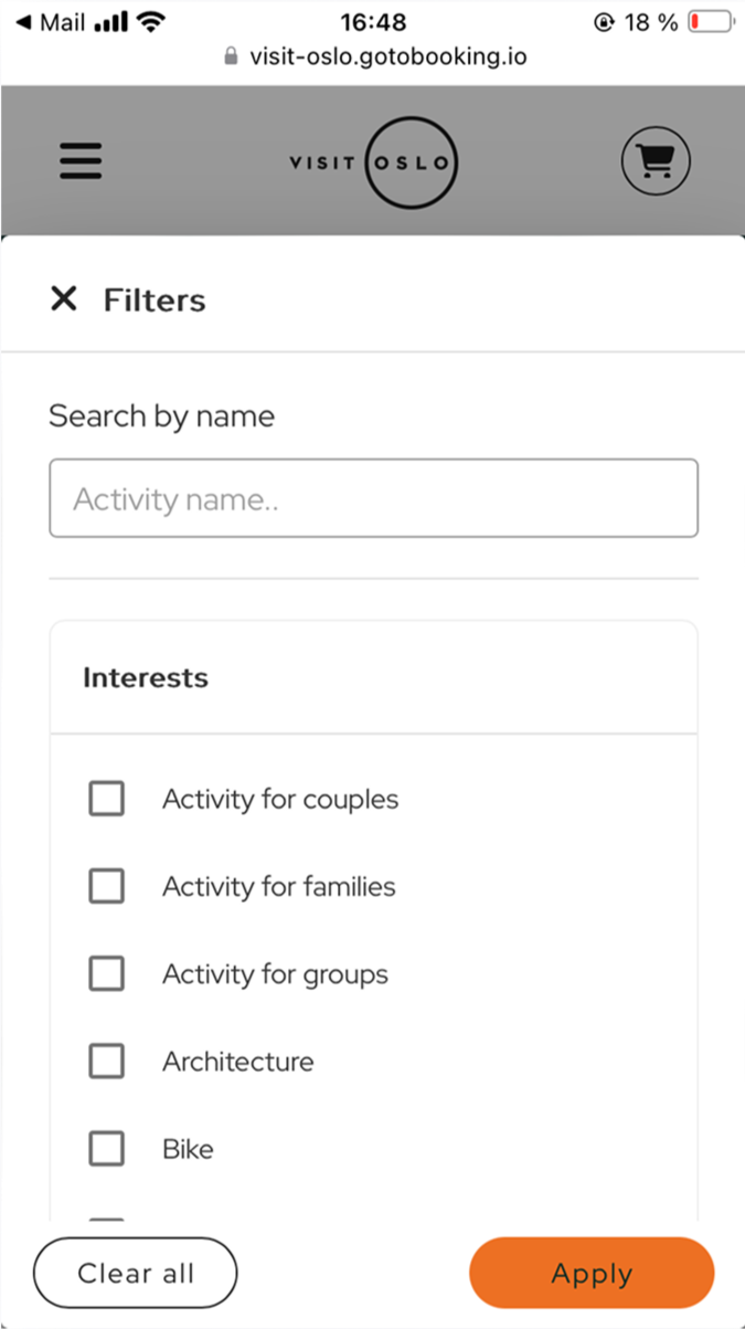
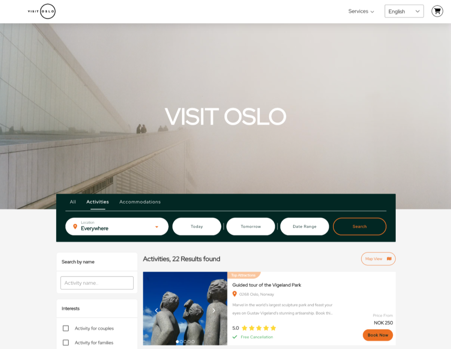
GoTo HUB’s current suggestion for Visit Oslo’s product landing page and filter.
PROCESS
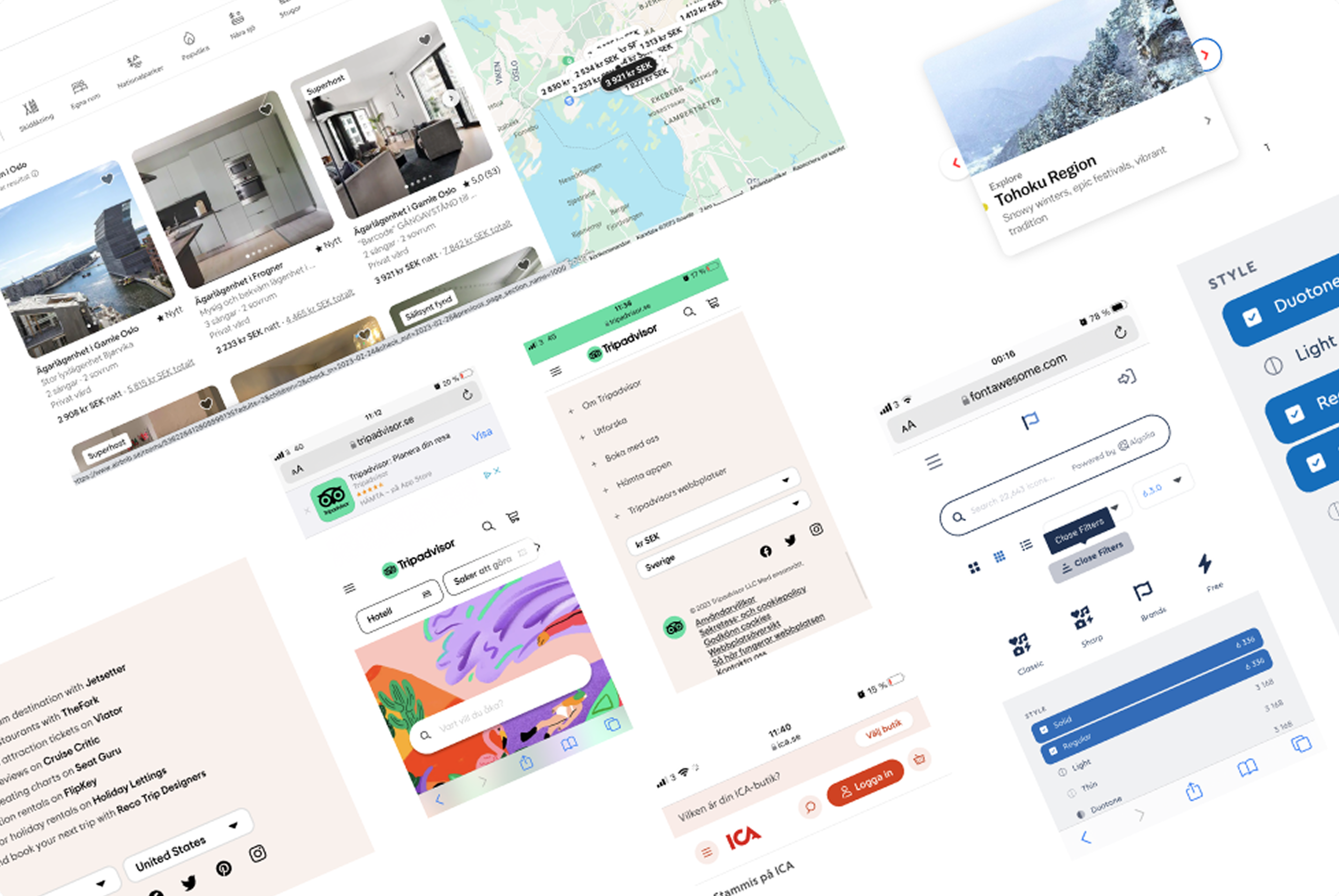
To get an understanding for best practices I focused on heuristics for e-commerce.
I also drew inspiration from brands like Tripadvisor,
Air BnB etc.
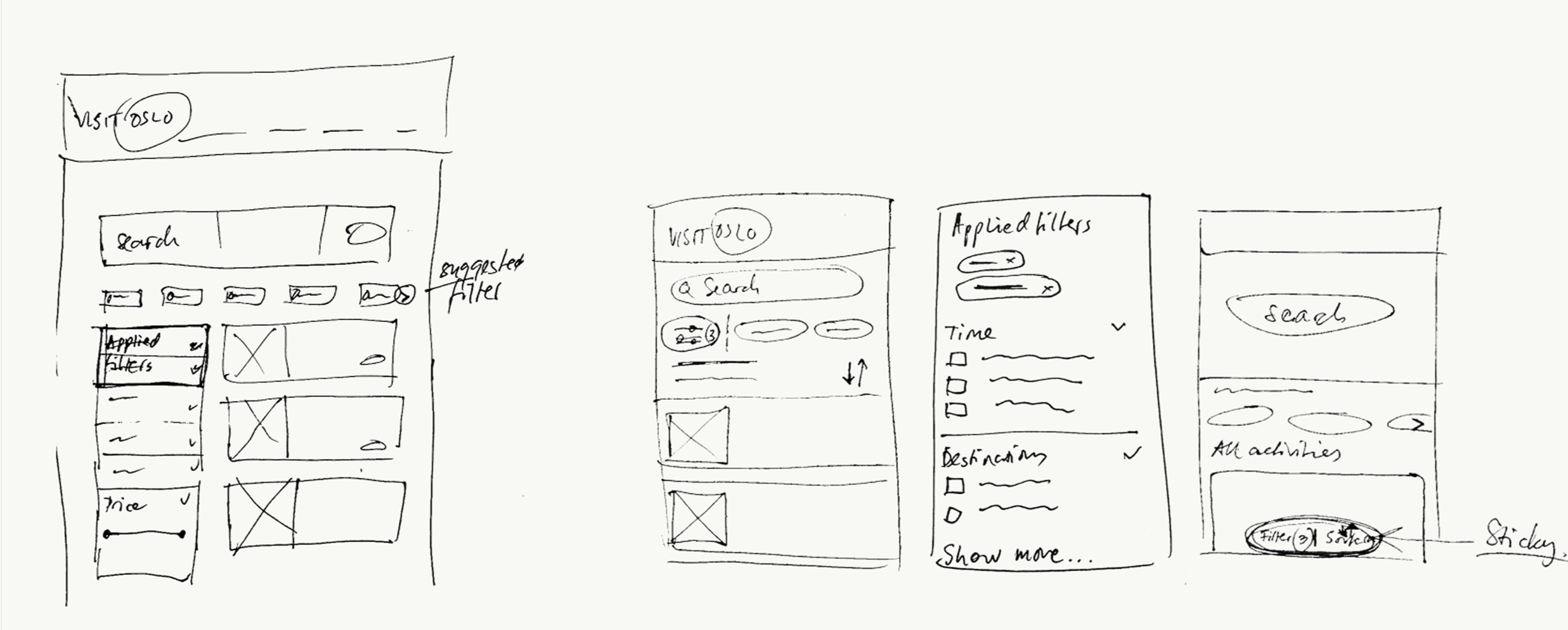
I moved on to low-fidelity sketching to explore ideas. Using traditional pen and paper allowed quick ideas and concept exploration.
Research and Low-fi wireframes
PROCESS
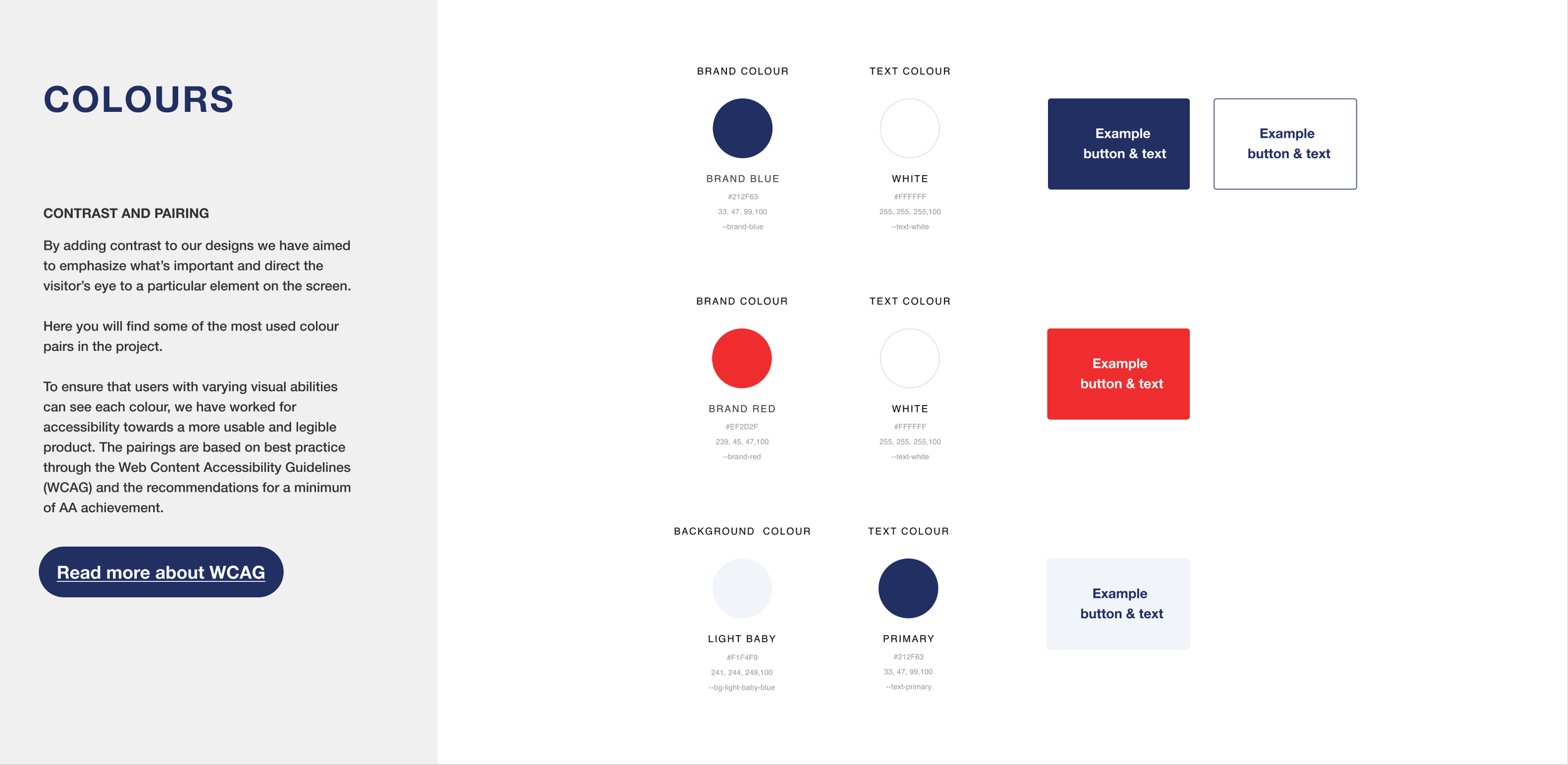
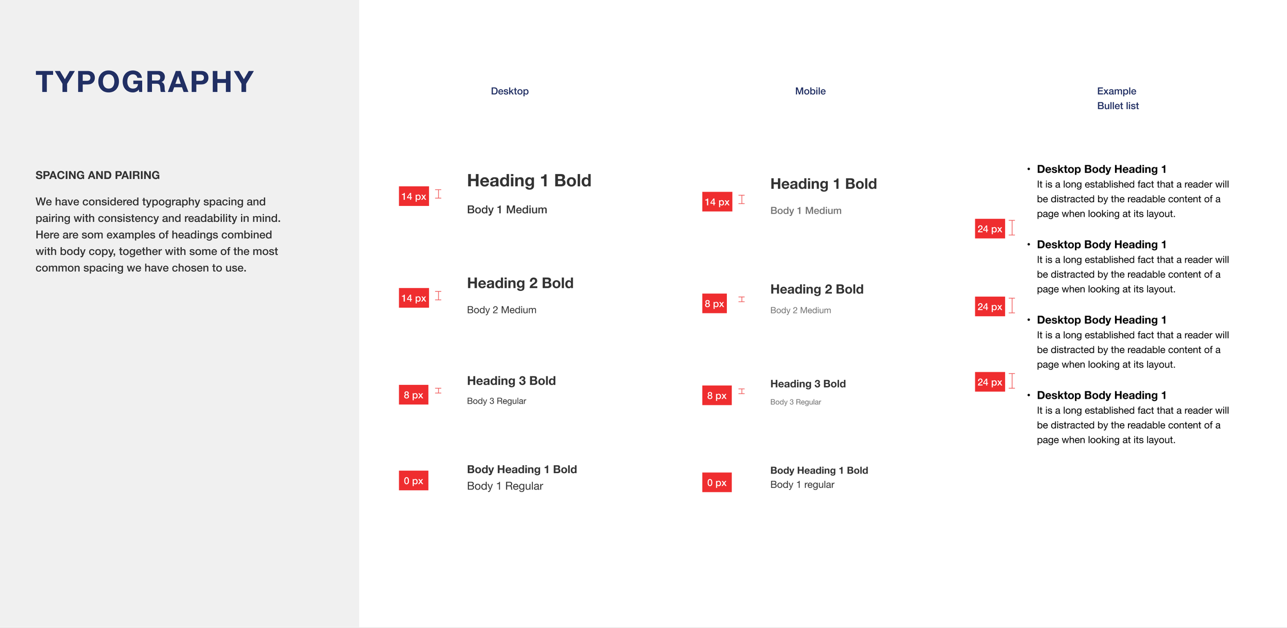
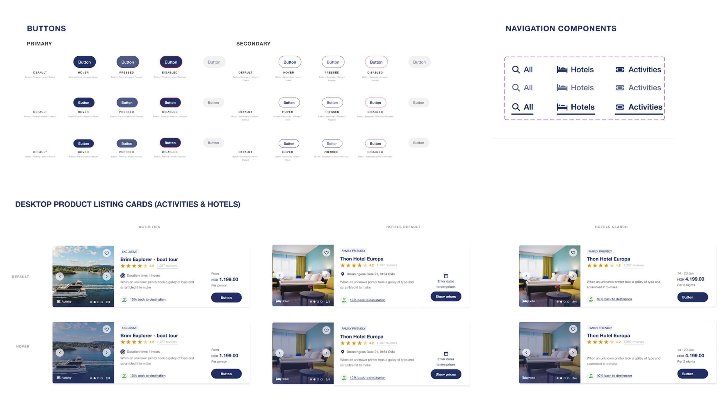
During the initial course phase, my team and I collaborated on a style guide, with some decisions shaped by our mentor. Consequently, I concentrated more on the technical aspects rather than expressing my personal design style.
A key individual task was creating a component library, which was both challenging and rewarding.
Design system foundation
SOLUTION
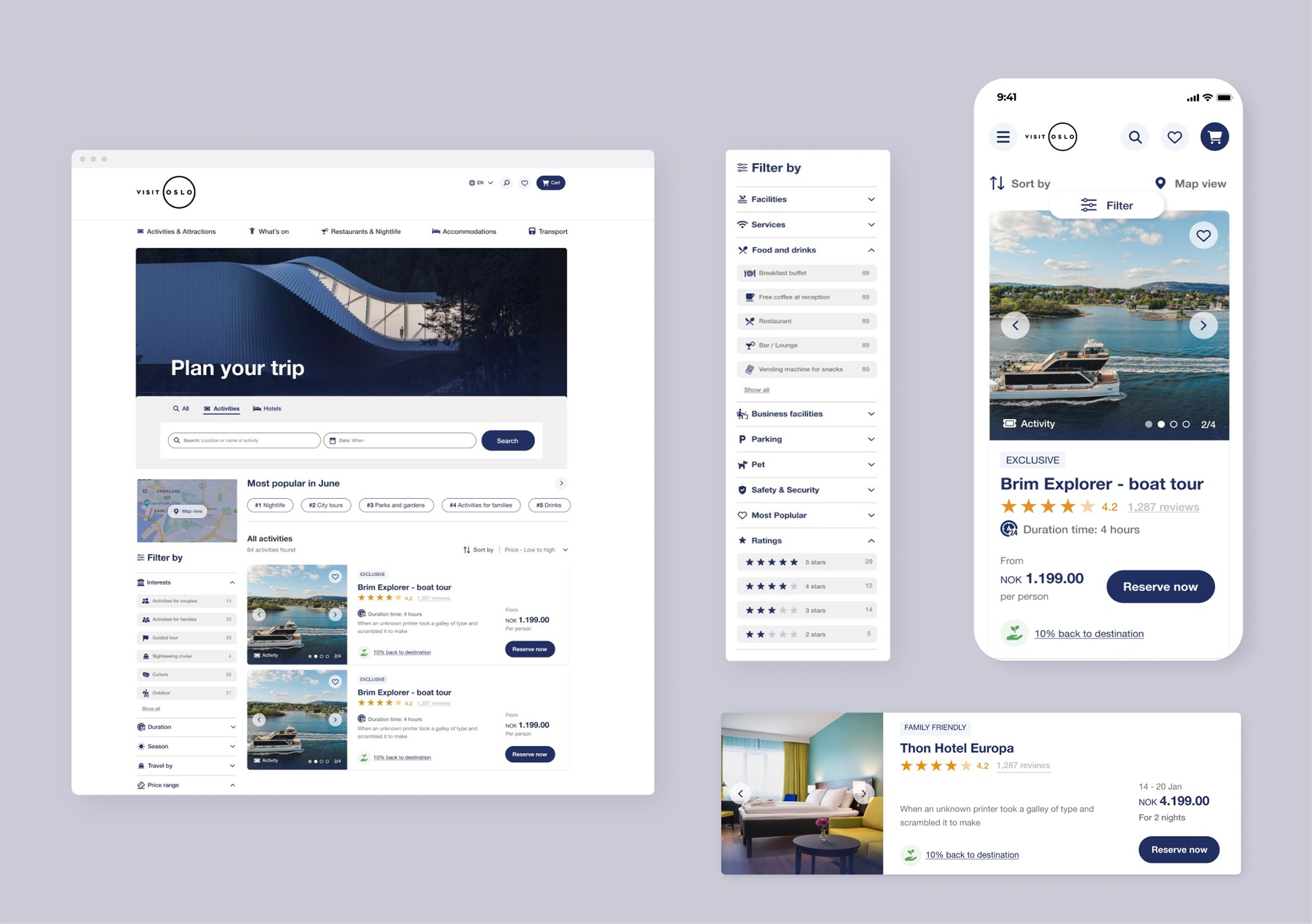
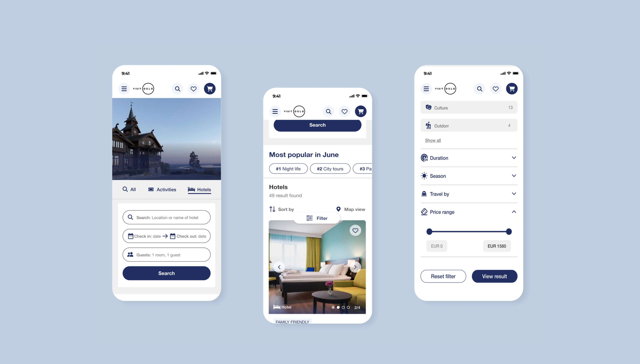
I designed a clean, minimalist high-fi prototype, guided by the style guide.
I had a couple of stakeholder and mentor meetings for feedback and refinement. However, time limits lead to only a few iterations.
High-fi prototype
Some of my design suggestions
Minimalist design with better hierarchy improving readability and visual appeal.
Larger clickable areas for buttons for easier interaction.
Filter with truncation – not overwhelming
for users.Sticky filter on mobile – for persistent navigation
CONCLUSION
The outcome

The result
If the widgets had been implemented they would hopefully boost conversions.
The accessibility improvements are important for higher engagement and satisfaction.
My well-explained style guide ensures design consistency.
My learnings
I really enjoyed working on user-centered UI design, inspired by well known sources like Baymard Institute and NNgroup.
This project taught me the value of creating
a design system and collaborating on a style guide.

What would be the next step?
Unfortunately I didn't have the opportunity to do user testing, due to time restrictions and the project's focus on best practices.
As the next step, I believe A/B testing should be a priority.